The Honors College at Oregon State University is a community of dreamers. Sharing these narratives with the world required a re-envisioned layout of the then-defunct college magazine. Here’s how I redesigned the magazine, and then fine-tuned in the second year of the redesign.
Honors Link
Design, photography
How has the magazine told the college’s stories?
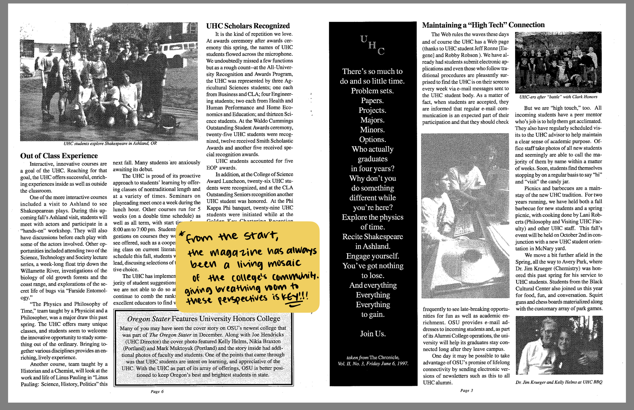
The first step was studying issues through the years. What was working, and what could be revitalized?


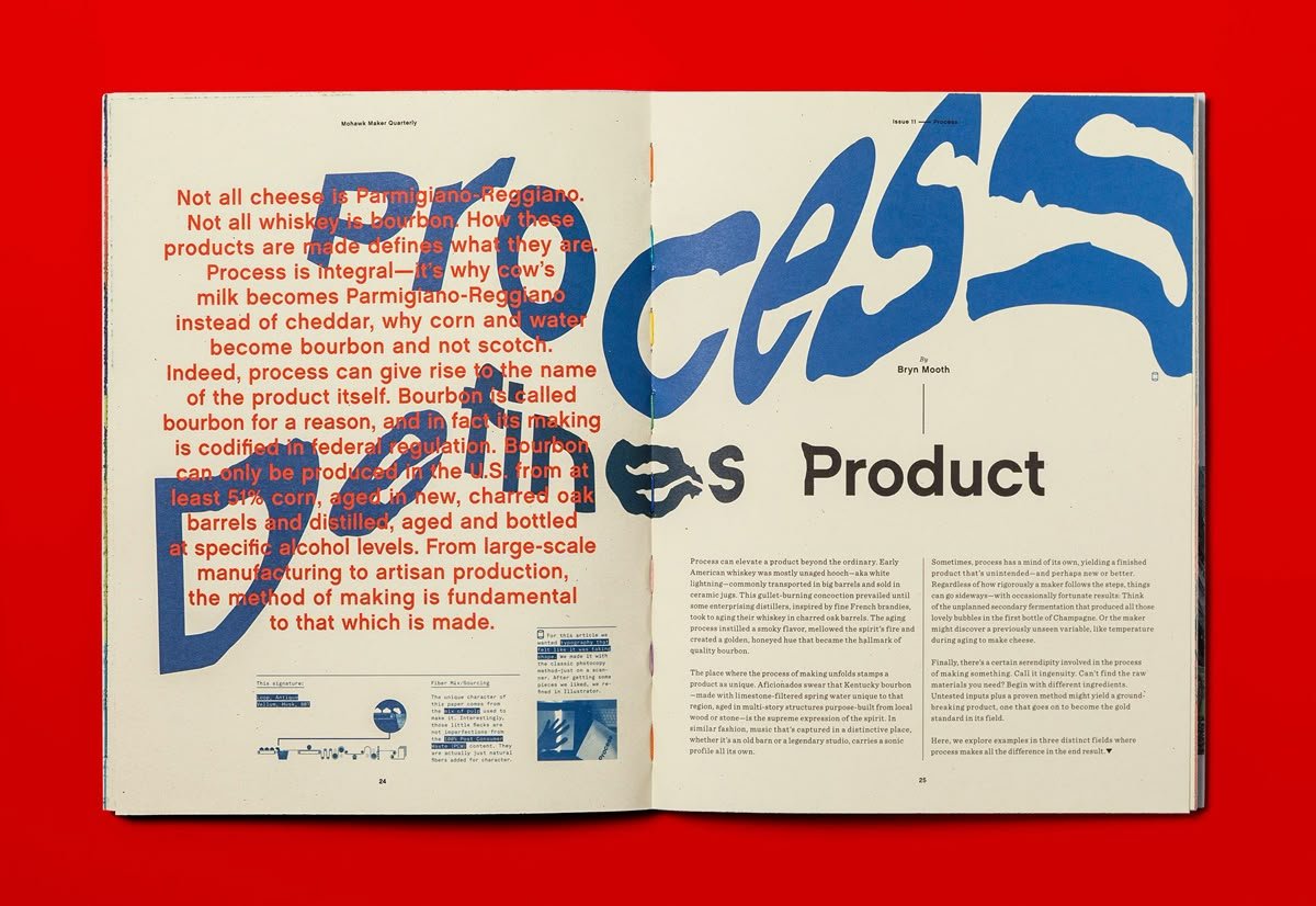
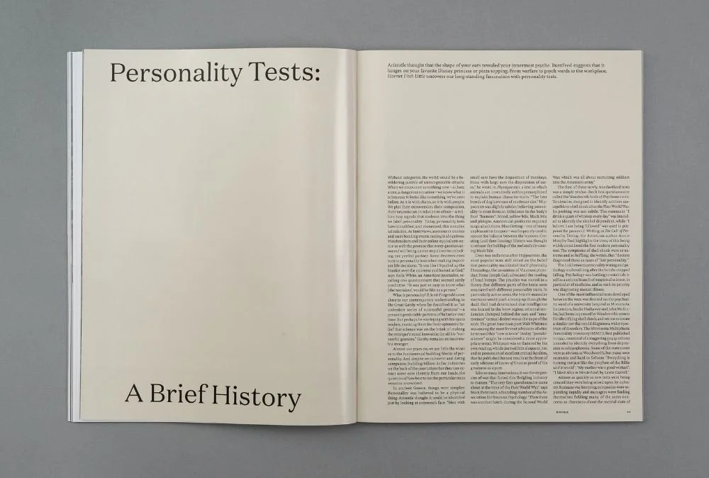
I was intrigued by the intro copy opposite the article itself. (Mohawk Water Quarterly Issue 11 via Pinterest)
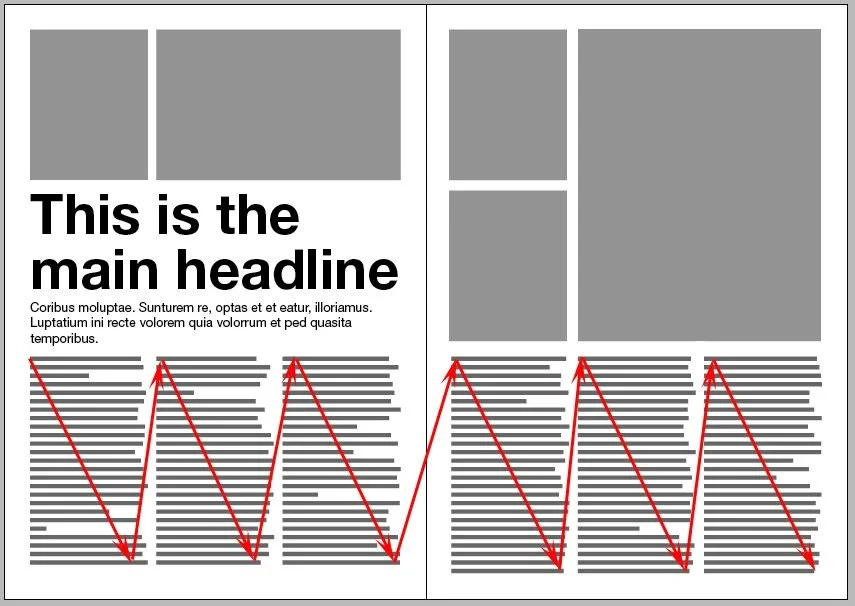
Understanding how readers read. (Magazinedesigning.com via Pinterest)
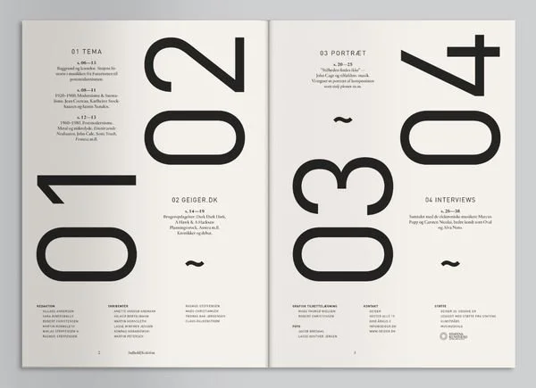
Love the bold table of contents! (Inspiration Hut via Pinterest)
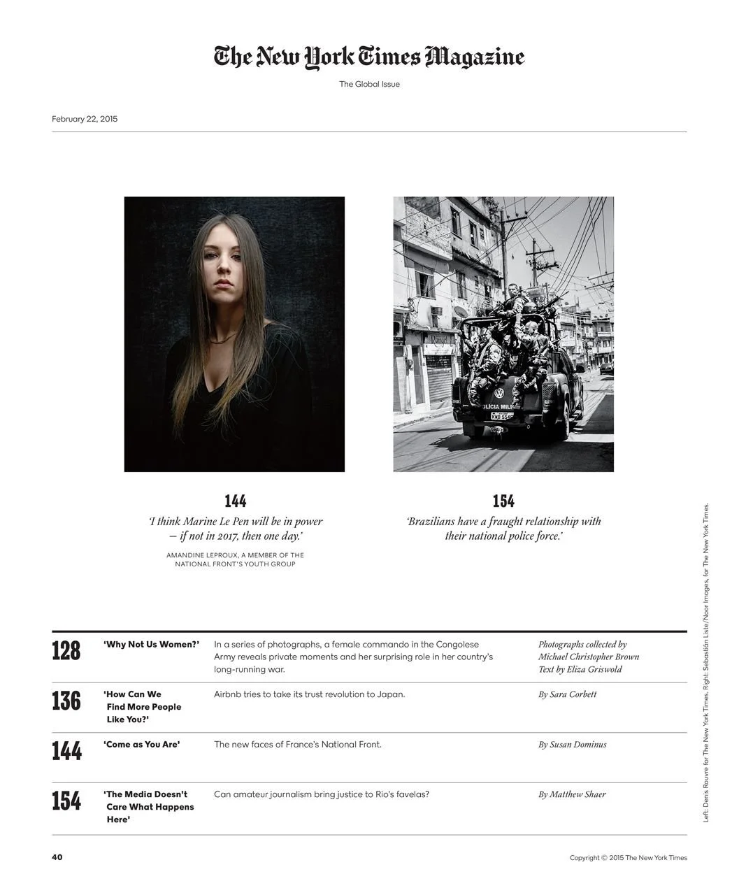
Another study of table of contents. (New York Times Magazine)
What should a college’s namesake magazine look like?
I had been dabbling in print pieces like fliers and posters, but developing spreads for a print publication was entirely new to me.
I found inspiration in my love for print, paying attention to the way table of contents and stories were presented, to seemingly small details like page numbers.
Kinfolk is one of my favorite lifestyle/design-centric magazines. I really like the use of intentional blank space for breathing room.
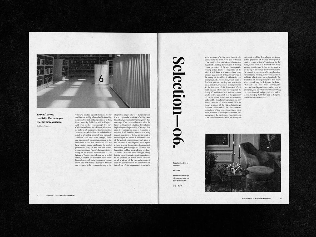
Exploring how photography can interact with text. (Kozmik Design via Pinterest)
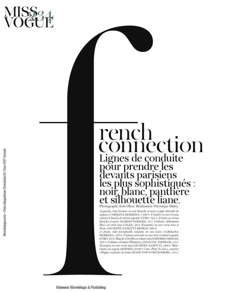
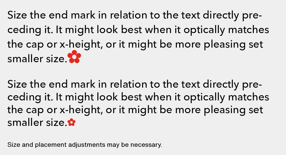
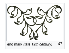
I’ve always been fascinated by end marks and drop caps. Exploring how a magazine might be complemented by them. (MyFonts/CARE typography/Vogue Paris, September 2011 via Pinterest)
Look at the way text can interact visually! (New York Times Magazine)
Putting it all together
I had to design within Oregon State University’s brand identity, which, coincidentally, was being completely reimagined at the same time I was redesigning the magazine. It created an interesting balance: we wanted the magazine to feel like its own sub-brand, while still aligning with the institution’s new identity. Here’s how that balance came together. ↓


As I had learned in “Your Daily Briefing,” the variation of weights and differing typefaces was nice in theory, but in certain instances, was rather loud and distracting to the reader.

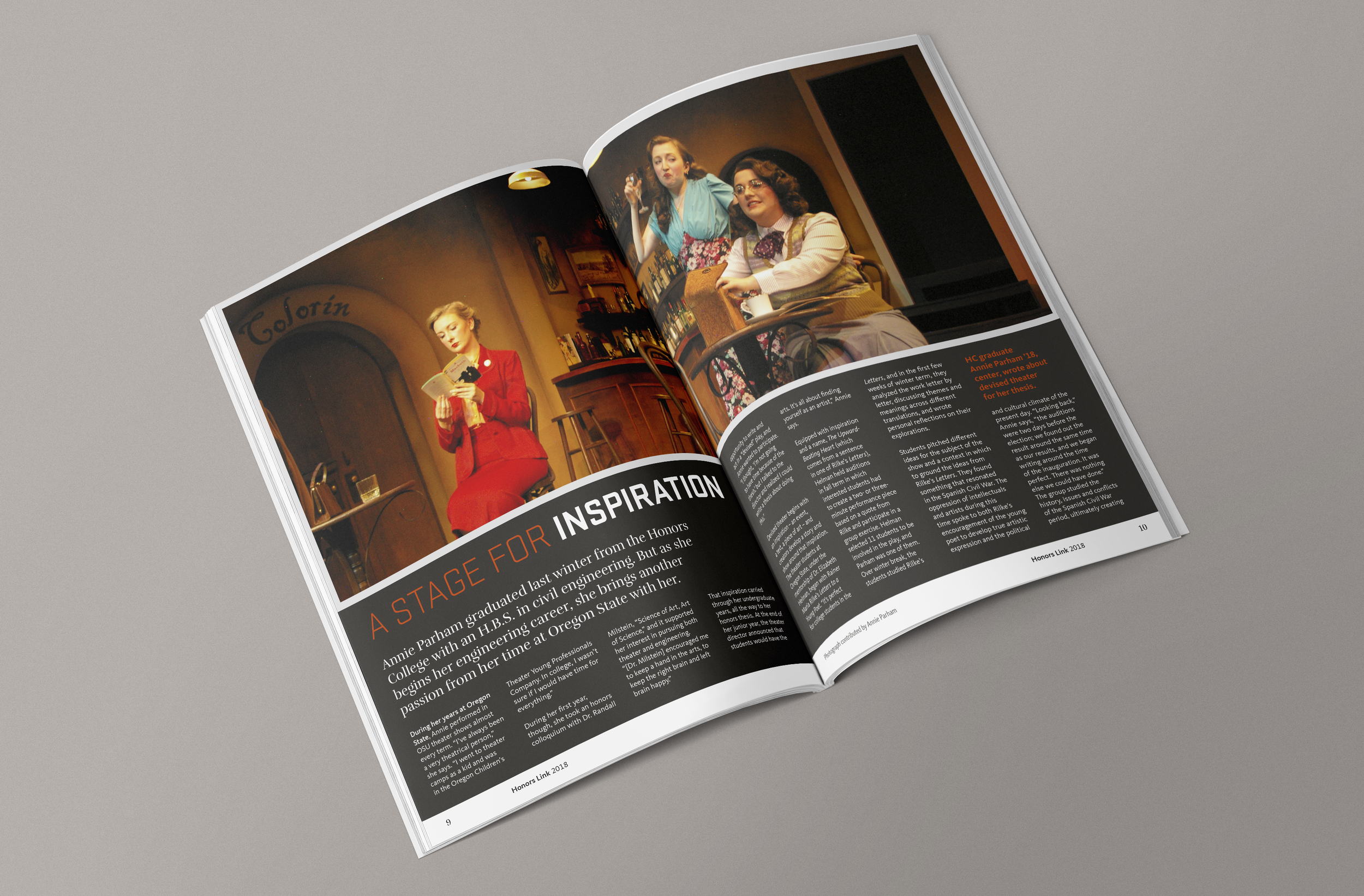
The return of the college’s magazine was well-received, but I noticed that it could be refined.
As I became more familiar with the new brand, the way the typography shows up, and understanding combinations of the color palette, I noticed areas for improvement as we headed into the following year’s issue. Namely, I felt the tracking and leading could be tweaked to improve legibility, and some visual elements like the end cap and color palette combinations felt distracting.
The second iteration helped me refine details that had escaped earlier when I was focusing on the larger layout. Here’s how the following issue came together. ↓


5,000
number of re-designed copies printed and delivered to Honors College community members, per issue
Lessons learned
Dates in the calendar are closer than they appear. I quickly learned the importance of progress checkpoints to keep the project on track. Something will always shift, and real-time adaptation is part of the process. This taught me not to cling too tightly to the version of the draft I imagined. Learning to let go of what I couldn’t control helped me focus on the essentials to the rest of the team could stay on time.
The fluidity of working from copy to layout to copy again. Our writer would send me nearly-final stories and I’d have to immediately envision how each one fit into the larger magazine and what layouts would support it best. That meant planning photography before the story was fully settled and adjusting layouts as copy evolved. I learned to anticipate what a story might need visually, plan photography sessions accordingly, and stay flexible even in the “final-final-final” draft stage.
It truly takes a team! The perspectives everyone brought to our editorial meetings shaped the magazine far more than any single element I designed. I worked on the visual elements, but what I really remember are the ideas we sparked together, and the questions my teammates asked that challenged me to rethink my approach for the better.