Making sense of COVID-19
Copy, design, strategy
It’s been exhausting and stressful to adapt our lives around COVID-19. In a moment when many communities turned to digital channels to find information, here’s how I led the Oregon Health Authority — the state’s public health agency — to meet the moment on social and empower Oregonians to stay healthy.
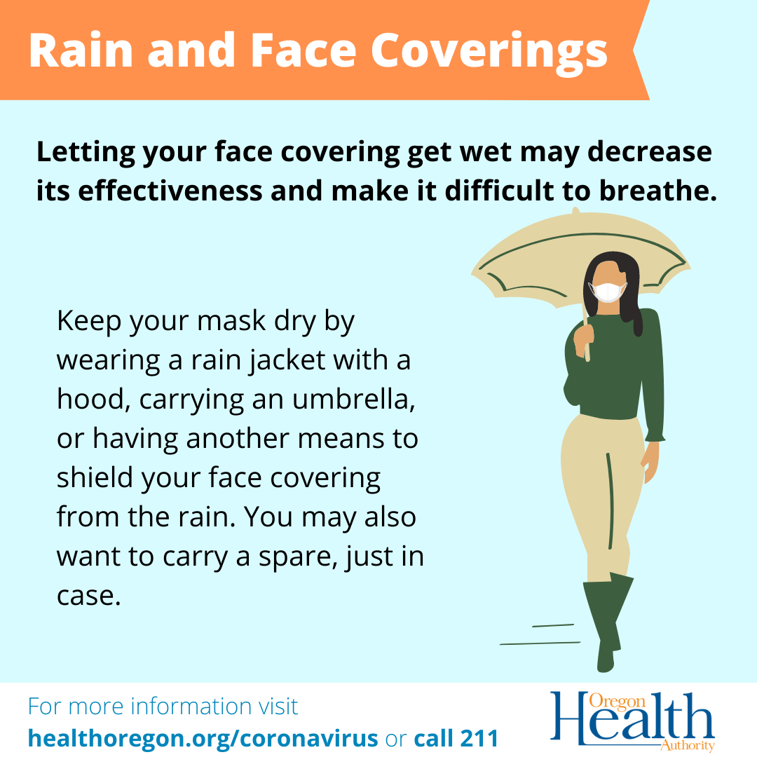
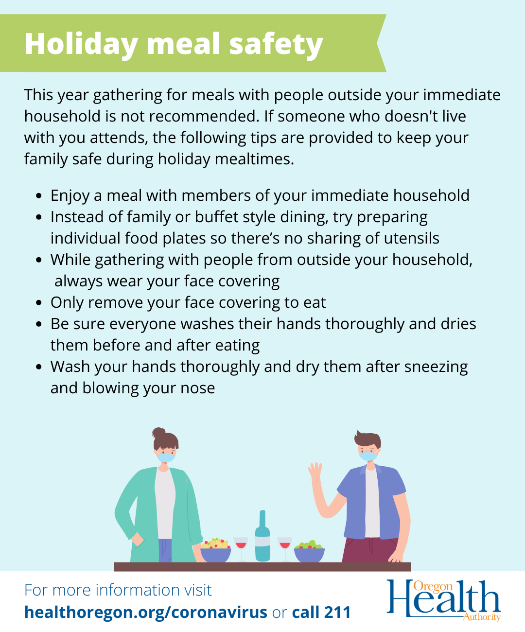
The existing design catered to urgent updates as public health responded to the pandemic. Now, as the pandemic entered a new phase heralded by the arrival of vaccines, these copy-heavy graphics and illustrations (pulled from stock) needed to express empathy and inspire trust.

Navigating an ‘infodemic’.
By December 2020, the arrival of COVID-19 vaccines offered hope, but we were also beginning to experience fatigue. Keeping up and making sense of what was happening was becoming difficult. The result was an “infodemic”: an overabundance of information — some real, but a lot, fictitious.
Trust in public health was plummeting, fast. How could we re-imagine our communications to begin building trust and provide the latest updates in a digital sphere rife with disingenuous headlines?
“Public posts that attracted more engagement were more personal, showed empathy to affected people, and expressed worry [...] merely sharing updated information and policies may be insufficient to capture public interest in official communications.”
Mheidly, N., & Fares, J. (2020). Leveraging media and health communication strategies to overcome the COVID-19 infodemic. Journal of public health policy, 41(4), 410-420.Like that friend who knows what’s up.
Another early challenge was thinking about how to share rapid policy changes and information updates. In addition to the opportunity to visually express data and policy changes, I explored providing additional context in an easy-to-understand way.

I strategized with the epidemiology team on a social media graphic that moved away from a momentary glimpse of the pandemic to one that provided broader context. The epidemiology team created a condensed version of the daily data dashboard update. The new dashboard graphic helped people understand how their actions were helping to curve case counts.

If we saw people sharing our posts, then we knew we had succeeded. To encourage this sharing, I reimagined the use of typography and structure so the information was clear and instantly legible, even on a small screen. This approach supported efforts to reconnect the state’s public health agency to people across Oregon during a moment when trust in public health was eroding.

Let's get vaccinated
Let's get vaccinated
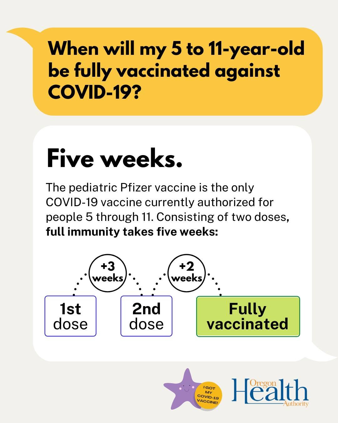
The COVID-19 vaccine rollout required a design that balanced rapidly evolving eligibility information while being mindful of concern. I created a distinct design system for these information updates, inspired by learnings from “Your Daily Briefing”.


To build vaccine confidence, the Oregon Health Authority tuned into real-time conversations to better support (and recognize!) people in Oregon making the decision to protect themselves and their communities.
As a result, people found spaces to share their experience.


Getting the facts.
To address disinformation, I broke down the science — like why boosters are necessary — and offered tips to people in Oregon so that they could spot and tackle misinformation and disinformation themselves.

Expanding beyond COVID-19
One of the most unexpected developments has been watching the redesign take on a life of its own. What began as a COVID-19 effort quickly spread beyond OHA, surfacing in the Governor’s communications and later in various other public health campaigns across Oregon.
I was honored to design the graphic for the launch of the 988 lifeline in Oregon. Together, supporting the launch of the 988 lifeline and COVID-19 communications has reiterated how design can support people in their most vulnerable moments.


6 million+
increase in the number of people who came across updated COVID-19 guidance on OHA social media after the redesign (YoY, organic reach)
Lessons learned
Listening is design. When I went in for my first booster, I noticed the “Am I eligible for a booster now?” graphic I had created printed out from our social media page and taped up to a clinic wall. It was a full-circle moment and a reminder that most of my time wasn’t spent tinkering away in Canva, but listening. I tracked conversations across our social channels, watching real-time hope, concern and frustration unfold. Sharing emerging questions and patterns with colleagues shaped not only our nimble social media approach, but also informed the agency’s broader response as more people in Oregon turned to digital sources for updates.
Accessibility centers everything. As my workflow developed, accessibility became a non-negotiable part of it. I regularly partnered with a colleague who specialized in health equity to get a second pair of eyes on color contrast, text size and the cultural sensitivity of illustrations. This collaboration has trained me to slow down and question my defaults. It also inspired to learn more about plain language, because accessibility isn’t the responsibility of one person.
Flexibility, flexibility. With so many teams involved, coordinating information during a fast-moving emergency becomes exponentially more complex. It wasn’t unusual for me to redesign graphics as new guidance arrived minutes before publishing.
Creativity grows with constraints. We didn’t have intricate graphics software. This limitation pushed me to focus on developing clarity and hierarchy, rather than being caught in the weeds with fancy design embellishments, and strengthened my ability as a designer and communicator.
Cover photograph: Martin Sanchez/Unsplash